Research
To decide what I would like to photograph, I need to do some research and see what other artists have produced. I want to look at landscapes, both urban and rural and think of what makes these photos interesting, what could have been done better, how I could recreate them in my own way and find out about the artists themselves, who are they? what inspired them? and what they have done for the world of artistry.
J.M.W Turner
Joseph Mallord William Turner was an artist who specialised in landscapes, Turner used watercolours, oils and engravings to produce beautiful works of art. Turner was born on 23rd of April 1775 in London to William Turner, a barber and a wig maker. Throughout his career Turner produced works of art of the British countryside, he also went on expeditions to other countries, finding things that he could put into his stunning works of art. As a young man Turner attended the Royal Academy Schools, he was an outstanding student at everything he tried, oil painting, watercolours, drawing and engravings.
Turner's inspiration comes from 17th century dutch artists such as Willem ven der Velde, and the Italianate landscapes of Claude and Richard Wilson. Just like the other contemporary artists of his age, Turner had no interest in breaking his ties with the past or reject his teachers, he wanted to join their ranks. This can be seen when Turner donated a painting to the nation that showed the founding of Carthage by Dido, on condition that it was displayed next to two famous paintings by Claude Lorrain.
Turner was a truly enviable artist: a precocious genius who rapidly gained recognition and for more than 60 years was successful in all genres of landscape, but all this success wasn't without criticism. those who came from a more traditional artistic stand point believed Turner's work to appear alien, even provocative.
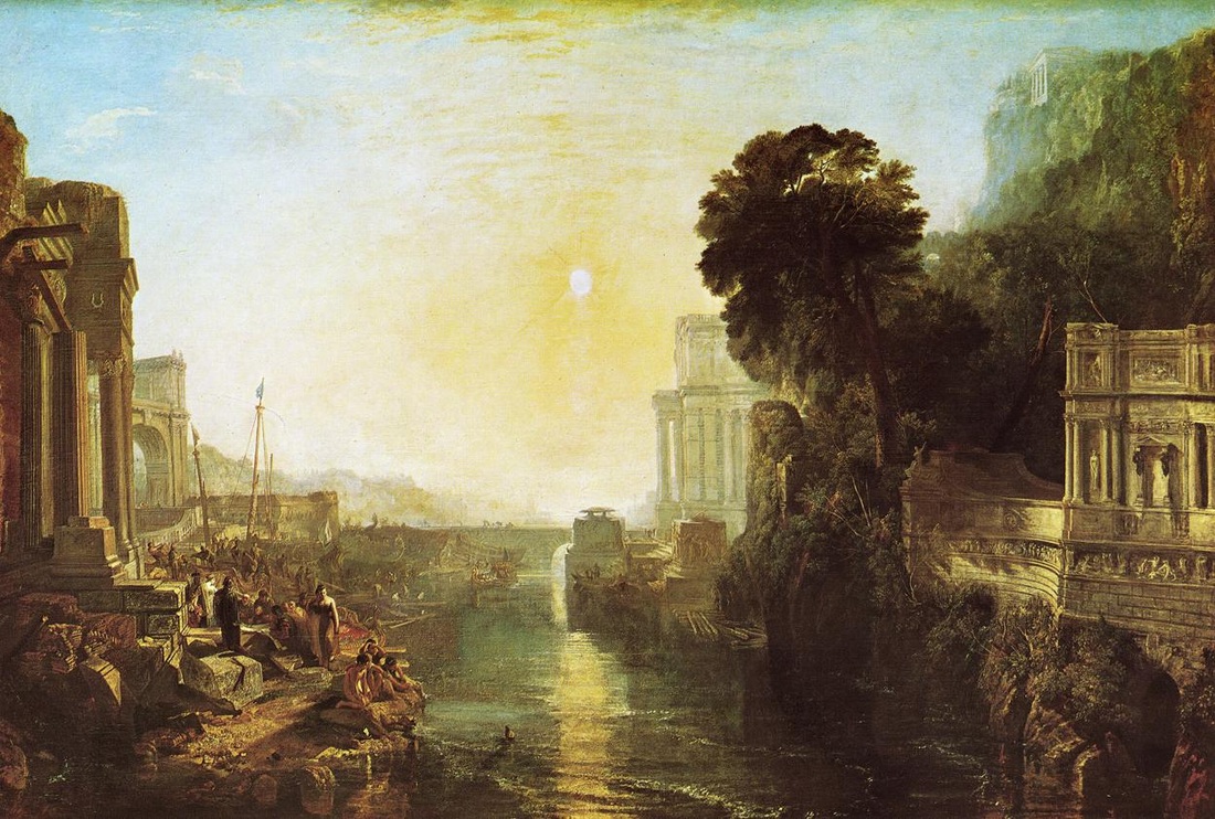
This is one of Turner's most famous works, Dido Building Carthage. Turner did this from 1815 to 1818. The painting shows Dido giving instructions for the building of Carthage, on the left most building there is an inscription giving the title of the of the painting.
This painting was shown at the royal academy in 1815, where it was received enthusiastically by critics. A few commented on the yellow colour of the sky, which Turner agreed with later painting over in white. Unfortunately one critic disagreed with all others, Sir George Beaumont's judgement of the painting was entirely negative saying the picture was executed in a misguided style that did not correspond to nature. nevertheless, Turner was very proud of this painting. Although receiving offers for the painting for very large sums of money Turner would never sell, and later asked for the painting to be exhibited in the national gallery next to the embarkation of the queen of Sheba by Claude Lorrain, which had inspired Turner to paint it.
From a photography standpoint I really like this photo, the composition of it is excellent, with the sun in the centre of the frame and the horizon just below the centre. Had the horizon been placed higher up the photo may have looked odd, if a shot is composed this way it looks more natural, as if the viewer were standing there.
I also really love the detail on the landscape, the building on the left and the tomb on the right are both sharp with a lot of detail. To get a shot to look like this when using a camera I would put the aperture to an f stop of about f/13, with the ISO on 100 or 200. I would decide the shutter speed once I had looked at the light meter and seen whether I would need a high or low shutter speed.
I would have the aperture around f/13 because then I get a not too deep but not too shallow depth of field, that way I can have all of the buildings in the foreground in focus in the painting but not start to get focus on the background, a little bit of blur on background will mean your eyes are drawn away from it to the area of the photo the composer wants you to look at, in this case at the people standing at the waters edge in the foreground.
One thing I don't like about this painting is the yellow tinge of it. I would have to agree with the critics of the 19th century. Maybe Turner painted it this way because of the setting sun and thought that it would fit correctly having the whole painting in this colour. If this were a modern day photograph, I would change the white balance, to avoid the tinge and make the photo look more natural.
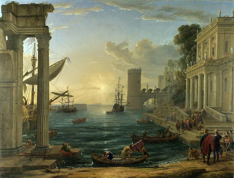
This is the painting by Claude Lorrain. This painting is the one that inspired Turner to do paint his, The title of the painting is the embarkation of the queen of Sheba. You can quite easily see the similarities between this one and Turner's. The building with the pillars on the left, the tree on the right and the water in the middle. Claude Lorrain was a French painter born in the early 17th century. this painting was done in 1648 and depicts the leaving of the queen of Sheba for Jerusalem, as the name suggests. Unlike Turner's, the painting isn't overpowered by the yellow tinge, the blue of the sky can be seen which in my opinion makes the picture look so much better.
I think recreating these paintings using tilt shift would yield some interesting results. Tilt shift is a technique used to make things that are normal sized to appear smaller, it can make a normal street view look like you are a giant looking down upon a tiny city of ants.
I think recreating these paintings using tilt shift would yield some interesting results. Tilt shift is a technique used to make things that are normal sized to appear smaller, it can make a normal street view look like you are a giant looking down upon a tiny city of ants.
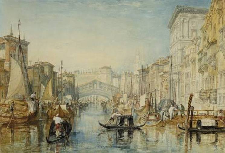
This is another photo by Turner. This time of the Rialto Bridge in Venice, this painting is one of the four watercolours devoted to the subject of Venice he painted following his first visit between 8th and 13th September 1819. Here the treatment is still traditional and strongly recalls 18th century models, in particular the engravings by Antonio Visentini based on the famous cityscapes by Canaletto. The drawing is precise and careful, the colours point to exceptionally close observation, and the light is clear and bright, not only in the sky but also in the reflections of the palazzos and gondolas and other boats in the water. The elegant bridge in the distance, the Rialto, is the focal point of the painting. The composition gives the viewer the idea of sitting in a boat on the water.
When looking at this painting for the first time I thought this would be a good idea for tilt shift photography. There is a lot going on, with all the gondolas and the people. But then the idea of having the photo taken from above the subject set in, although I really like the composition of this painting, I don’t think it would work if the tilt shift technique were applied. That said, the scene itself would be excellent for a tilt shift shot. If I were to recreate something like this I would compose it from a different position, if it had been from a view over the scene like on a building then tilt shift might look good on this image.
I liked researching Turner. I found it refreshing looking at art from the 19th century, it supplied a different view on things, and Turner has a very good way of turning his view into beautiful art, maybe that’s why he is called Turner...
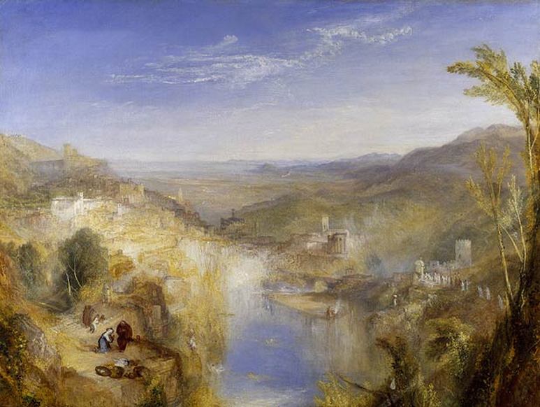
This is one of Turner’s many landscape pieces of art. It is of the Campagna outside Rome and the area around Tivoli. The Painting is called The Pifferari, who were shepherds from Abruzzi who travelled to Rome during the winter shortly before Christmas as street musicians in order to play folk music.
The painting itself is quite vague, this was Turner’s style. He did a lot of paintings like this but the previous two were quite sharp and the viewer could easily tell what was going on in the scene. With paintings like these, the viewer sometimes has to stand back for the full effect, standing too close makes me not like the painting as much. In the bottom left, you can see a detail scene of the shepherds, this contrasts a lot with the rest of the painting.
If I was to recreate this shot and apply tilt shift, I think the photo could look quite good, The viewer is looking down onto the scene, which would make the miniaturisation quite believable.
Olivo Barbieri
Olivo Barbieri is an Italian photographer born in 1954. Barbieri produces photos that appear to be digitally manipulated in Photoshop but are actually produced using his photographical technique, among other works Barbieri has produced tilt shift style photos.
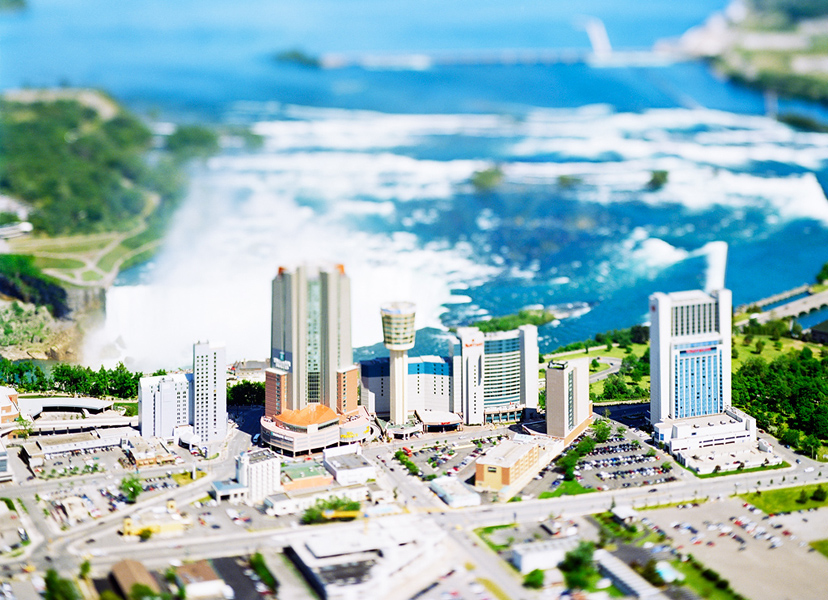
This photo by Barbieri is of Niagara Falls in North America, he took it in 2007. It uses the tilt shift technique very well; Barbieri uses a tilt shift lens, as opposed to Photoshopping the photo later on to get shots like this. He also uses a helicopter, suspended between 300 and 500 feet above the ground to enhance the feeling that the viewer is looking at a miniature scene. That is what I think makes the photo so believable. To make tilt shift work the best the photographer has to be higher up than the subject; this makes the photo look like you’re seeing through the eyes of a giant. If the photo had been taken from below the buildings it would not have the same effect and the photo would not be believable. As we can see Barbieri has focused his camera on the tall buildings in the centre of the photo, he has adjusted his focus plane to incorporate all of those tall buildings, this draws your eye towards them and makes them the subject of the photo. This makes sense as they are the most interesting part of the photo, had Barbieri focused on something else my eye would want to keep going back to those buildings. The tallest building of the group is not completely in focus, the top half of the building is very blurry and it doesn’t quite look right, the more I look at that part of the building it looks out of place and wrong. As I said earlier though Barbieri uses a tilt shift lens, and may not have been able to see that the building was not entirely in focus, maybe if the tilt shift part had been applied in Photoshop this would not have been a problem.
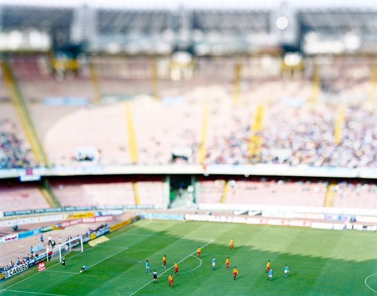
Another photo by Barbieri. This one is of a football game in Napoli in 1999. This photo is part of his Virtual truths collection, a collection that has some really good tilt shift shots.
This shot; much like the last one has the focus set on the bottom of the frame. This is because the most interesting part is here! This time the focus plane is wider, bringing more of the photo into focus. Barbieri may have manually done this so all the players could be seen well or this could be because the players are physically closer together than the buildings in the last photo.
The spectators in the background are very blurry, this has a positive effect on the photo as it means the viewer looks straight away at the players at the bottom, and the crowds steal none of the attention that should be given to the players. I like the image, but I can’t really seem to understand what is going on in the image. Is the game in play? It looks like the referee has stopped the game for some reason which is unclear to me. This type of photography relies on large scale images, those of cityscapes and similar large scale scenes, there is so much happening in the image that nothing can really be expressed in further detail, the viewer doesn’t know what’s really going on in the photo, yes they can see a scene but they may not be able to understand the emotion and the feeling of the subjects in the photograph. We don’t know what the score of this game is, who is playing or what type of people they are from the image. The viewer of an image like this is kept at a distance, not allowed to interact with the subjects at all. This is one of the advantages and disadvantages of tilt shift photography. This is what makes the miniaturisation so good, the subject of the photo feels small and insignificant to the viewer but it also means that the viewer cannot understand the subjects emotions very well, making tilt shift photography quite an emotionless art form.
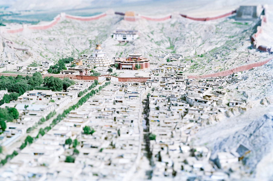
Another photo in Barbieri’s collection “virtual truths”, this one of Gyantzel in Tibet, 2000. This one also exhibiting tilt shift technique.
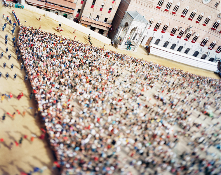
Photo by Barbieri, part of the "Virtual Truths" collection
Adam Burton
Adam Burton is one of Britain’s leading landscape photographers. Burton has entered his work into the Landscape Photographer of the year and has been commended or highly commended every year since 2007. His work includes pictures of tranquil scenes from around the globe, many taken in England. What makes Adam’s work so unique is the seemingly effortless beauty of them, each and every one of his shots exhibits awe inspiring natural beauty that most photographers could only dream about. Burton uses a combination of natural beauty, his ability to take the very best of every scene, and his technical skills in Photoshop to create these great pictures.
Adam Burton first became interested in Photography in 2001, He began by teaching himself the tricks of the trade getting his inspiration from magazines. He would go out and put into practice what he had learnt. Ever since 2004, his images have been published regularly in national newspapers and magazines, as well as in books, greeting cards and calendars.
Adam Burton first became interested in Photography in 2001, He began by teaching himself the tricks of the trade getting his inspiration from magazines. He would go out and put into practice what he had learnt. Ever since 2004, his images have been published regularly in national newspapers and magazines, as well as in books, greeting cards and calendars.
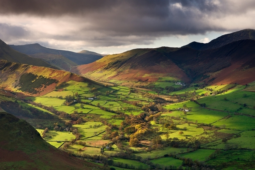
This photo by Burton is part of a group of photos he put up for the Landscape Photographer of the Year award. This photo, taken in 2010, is of the Lake District in Cumbria. I chose to look at this photo because I think it could be quite effective if I apply tilt shift to something like it. The position of the camera above the subject would make the photo believable, and there isn’t anything that really stands out as an individual subject, the scene itself is the subject. One of the problems with tilt shift is that it can confuse the viewer. Sometimes it is hard to tell what you are supposed to be looking at but with a photo like this, where the whole scene is supposed to be viewed as equal, it could work well. The image itself, is very good, I particularly like the dark shadows created by clouds on the hill on the right, and sunlight on the left. The hills themselves are very interesting and the scene looks like it could be a miniature scene anyway!
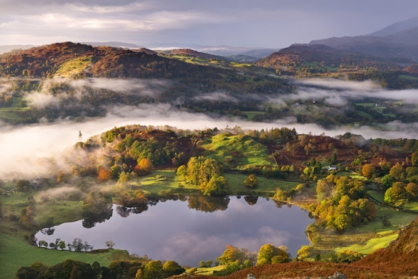
This is another photo by Adam Burton. Like the one before, this one is of the Lake District in Cumbria. This photo was highly commended in the Landscape Photographer of the Year competition. Just like The previous photo, this shot has a very dramatic landscape in. I think this could also be made into a really good tilt shift shot, as it already looks like it could a miniature scene. The low lying clouds create a mystic atmosphere, and the calm pond in the foreground gives off a relaxing feel, due to the stillness of it.
If I was to apply tilt shift to a shot I had taken like this I would set the focal onto either the pond in the foreground or the small hills just behind it. The problem with this photo is that there are a few different areas of the shot which are interesting and eye catching, this could be a problem. As you can only have so much in focus when using the tilt shift technique.
If I was to apply tilt shift to a shot I had taken like this I would set the focal onto either the pond in the foreground or the small hills just behind it. The problem with this photo is that there are a few different areas of the shot which are interesting and eye catching, this could be a problem. As you can only have so much in focus when using the tilt shift technique.
